
Hi, I’m a multidisciplinary designer currently living in Cambridge, MA. I have experience creating digital content, UX/UI designs, and graphics for print. Check it out.
Community
OVERVIEW
Community is a product I’m currently working on as spec work to expand my skills in UI design.
It is a work in progress.
The idea behind the product is that this app/website will be a place where everday people like you and me can go to invest in real estate the same way we invest in stocks, ETF, and crypto on apps like Robinhood and Coinbase.
ROLE
Product Designer
UI Design, UX Research, Problem Solving, Wireframing, Design Kit, Visual Design, Branding/Identity
March 2023 - Ongoing
Background
I often hear people, who are much more financially literate than I am, talking about, “investing in real estate,” like its the holy grail of making money. I started looking into what they were talking about and found these real estate investment apps, but they’re boring. The colors they use are dull, the amount of copy they have on each page is daunting, and the information they give is definitely not for beginners like myself. in other words, they are not user friendly.
I am a UI Designer, not a financial wiz.
So here is my crack at creating a real estate investment app that appeals to the newer generation of investors.
Branding
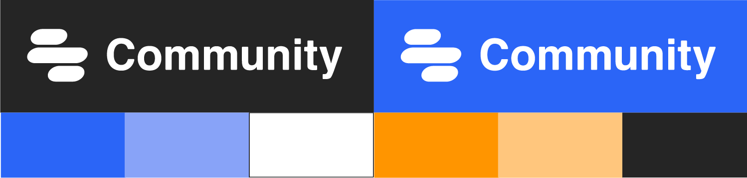
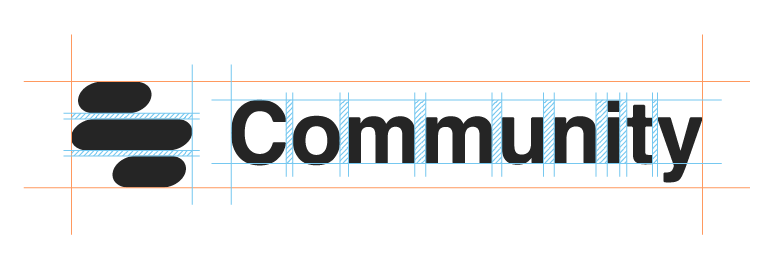
First, I had to create a brand for this fictional company. For the logo I wanted was going for a sort of abstract equal sign. The final product came out to be a cross between and equal and a divison sign symbolizing the shared investment in these properties.
Helvetica is the font for the company name. I don’t always like to use Helvetica because it is already used so often, however when it’s right it’s right, and it’s definitely right here.
I chose orange and blue, along with black and white as the primary colors. They grab attention, instill trust, and inspire confidence. From a UI prespective, since orange and blue are complimentary colors, they are easy to view and provide good contrast when used correctly.
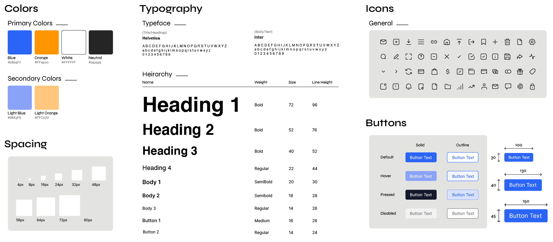
Design Kit