

Hi, I’m a multidisciplinary designer currently living in Cambridge, MA. I have experience creating digital content, UX/UI designs, and graphics for print. Check it out.
Hulu
OVERVIEW
Hulu is a streaming service that offers TV shows, movies, sports, news, and even live TV channels.
This was a personal project where I created a new interface for Hulu by combining the best parts of all the most popular streaming services to produce the ultimate viewing experience.
ROLE
Product Designer
Product Strategy, User Research, Wireframing, UX/UI Design, Prototyping
Jan 2023

Background
I love watching films and tv shows. They’re more than something to pass the time with. For me, they’re a form of artistic expression that I can critique, form an opinion on, and debate the meaning of with my friends and family.
I subscribe to many streaming services. Hulu is by far my favorite as far as content goes, but there are aspects of their interface that have always bothered me. These annoyances inspired me to create this redesign using elements from a variety of streaming service to create the one ultimate user interface, in my opinion.
Considerations
To start this project I spent a few days really analyzing Hulu’s website on my laptop, writing down everything I didn’t like and wanted to change. Then, I began researching design solutions and seeing how other streaming services deal with these problematic elements.
The main areas I wanted to focus on were:
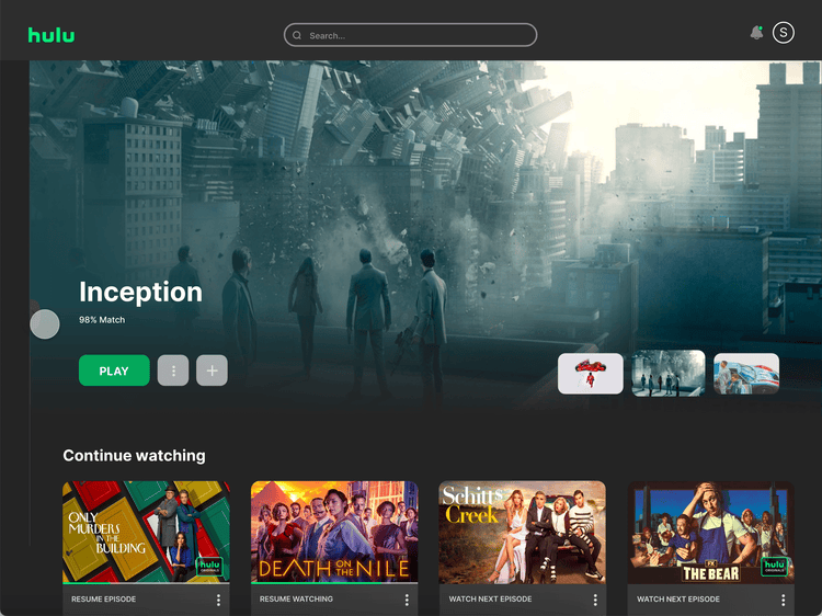
- The menu. Instead of a top nav bar, I was inspired by HBO Max to work with a side nav.
- Content heirarchy. I personally don’t understand why “Continue Watching” or some other personalized category isn’t the first section of content on every streaming service.
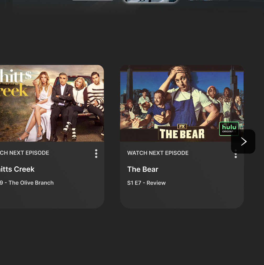
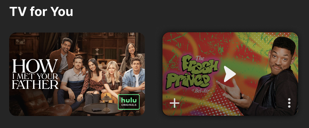
- Thumbnail and hover designs. I wanted the thumbnails to be bigger and really speak for themselves, while still have all the necessary information just a click away.
Wireframes
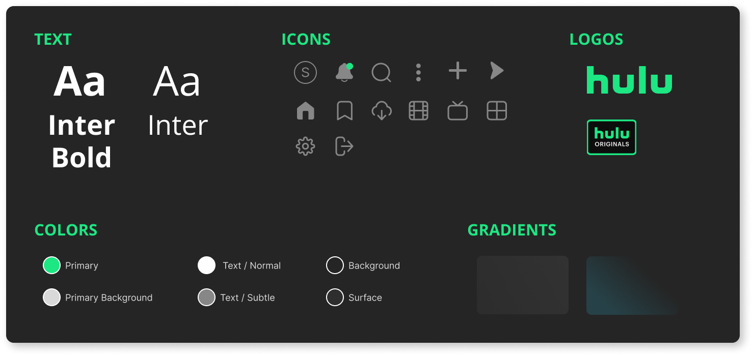
Once I had all the elements thought out and scribbled down, I was ready to create my wireframes. I used Inter font for the entire page, varying its size, weight, and color between headings and bodycopy to show importance. I laid out the look of my side nav along with the top serach bar and content thumbnails. And finally, I created my own icons to match the clean, minimal feel I was going for.

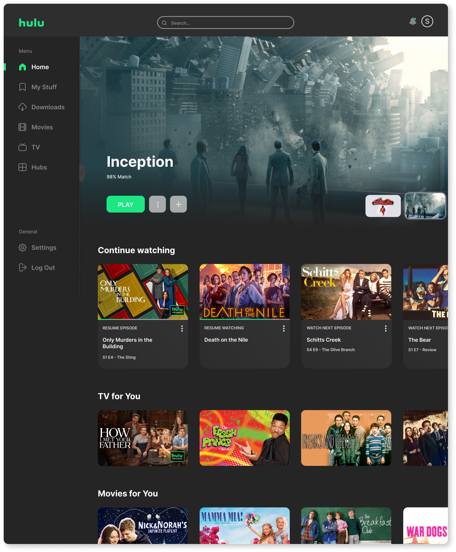
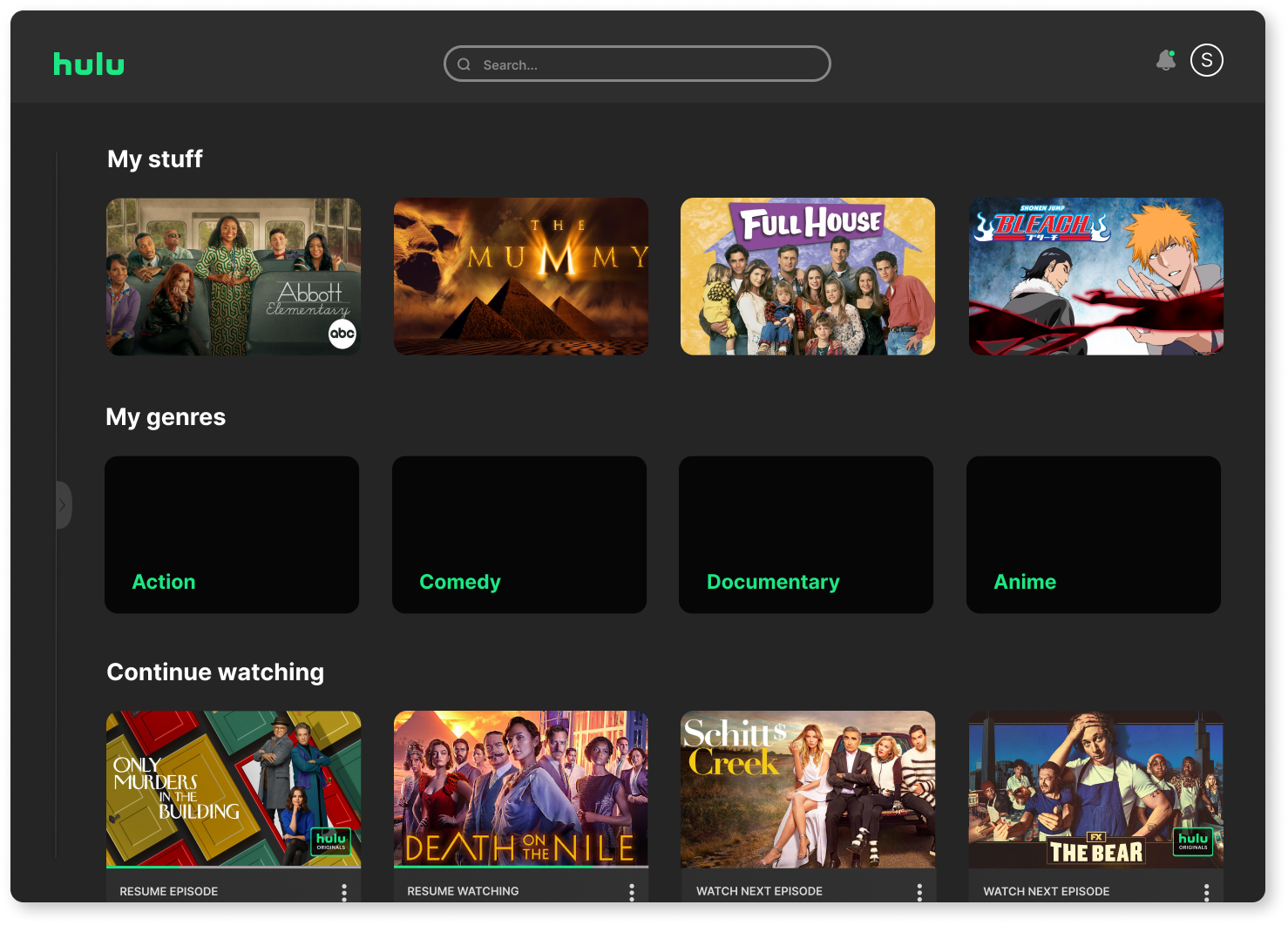
Design
Without changing hulu’s branding, I added gradients to comand the user’s attention to the information I wanted to share with them, and used shading to highlight the elements most important to the user.
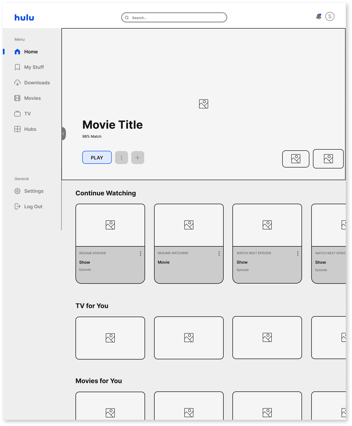
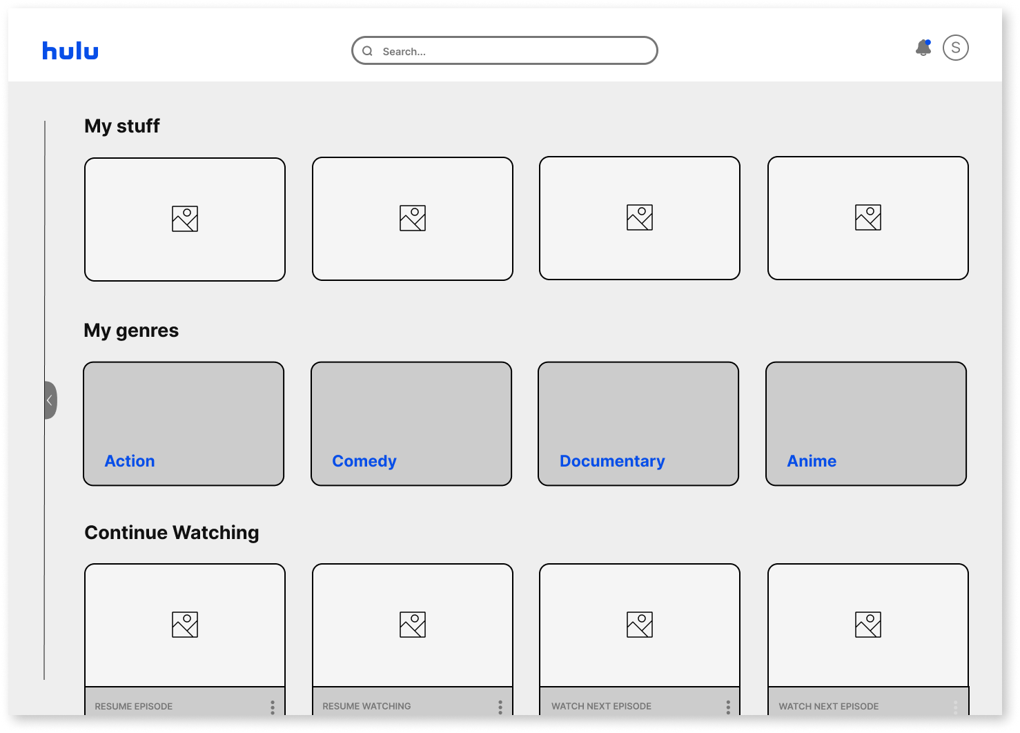
The design of the side nav is similar to the way Hulu’s top nav is set up currently, but this way there could be more options or customizations without looking cluttered, or overwhelming, and it would has the ability to be hidden whenever the user wants.
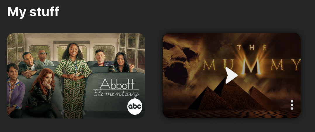
The photo on the left shows what the home page with the side nav open would look like, and the photo on the top right shows what the “My Stuff” page with the side nav closed would look like. Notice how the content that is shown at the top of the pages are the user’s custom lists.
Prototype
Below you can see how the side nav eases in and out and a few of the hover effects.
In practice the side nav would also follow the page as the user scrolls, and the header would scroll out of the frame.
I created three different hovers for the thumbnails, one for “Continue Watching” thumbnails, “My Stuff” thumbnails, and all other thumbernails. And of course there is a hover to show that there are more options for each category.

Key Takeaways
Overall, I’m really happy with the final product of this redesign. It gives the site, as a whole, a fresh look, making it easier to navigate, intuative, and modern.
While developing this project I learned:
- The power of a wireframe kit. Originally I had tried to create my wireframes without a kit and my whole work area just became an i-Spy of various font sizes, font weights, and color shades.
- Reflection. Throughout the making of this project I kept loosing sight of what I want to accomplish. I had to constantly remind myself to take a step back, look at the overall picture, and reflect on the nature flow of the project.
As a next step, I would like to work on a settings page that allow the user to customize their own home page. A feature like this would bring a whole new side of UX to streaming services.